Branding, Design, and Photography
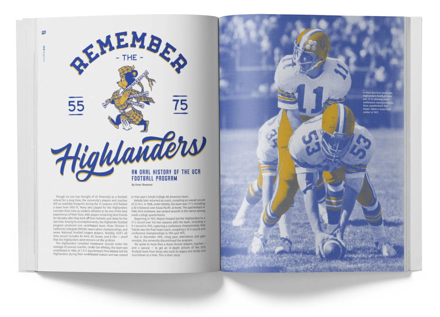
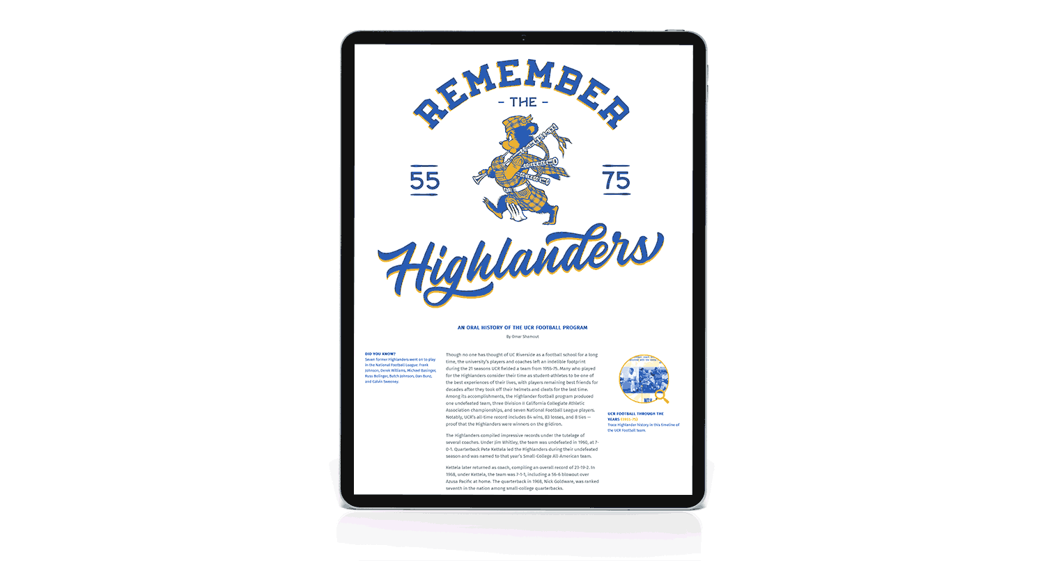
Remember the Highlanders
Football has always been a popular topic at UCR since the team was discontinued in 1975 despite winning three conference championships in its final three years. My goal was to bring out the nostalgia and history of the team, which required a lot of digging in the UCR archives for proper photos and even old marks which were then photoshopped for repair, then given a two-tone style to give it a retro feel.
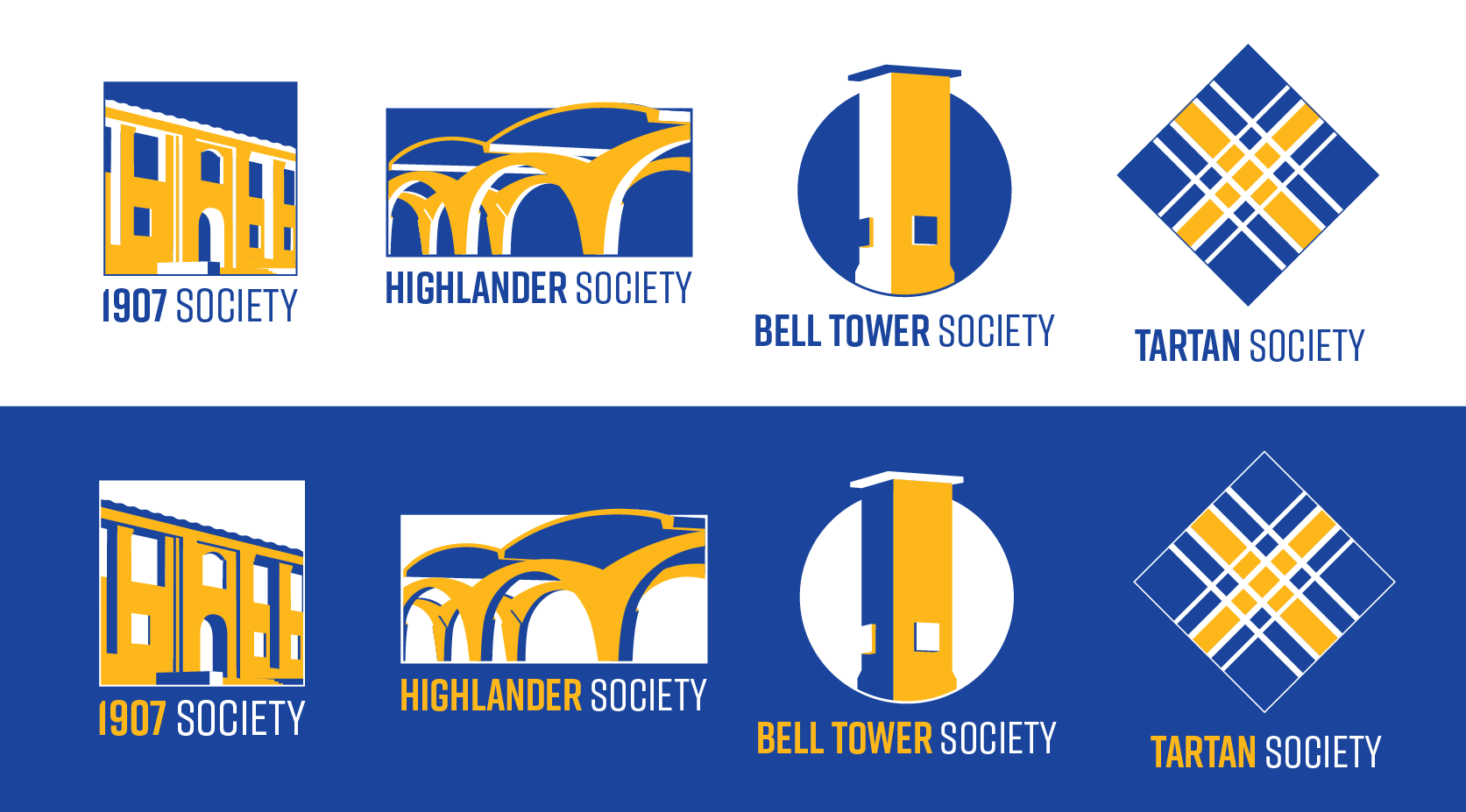
Giving Societies Rebrand
Our giving societies were given new names and we wanted to explore different ways we could make a cohesive look and bring all of the giving societies together under the same umbrella. Leaning into the Mid-Century Modern architecture that dominates UCR’s campus, I wanted to build a simple, yet flexible brand that reflected the universities uniqueness and spirit compared to its’ other UC sister campuses.
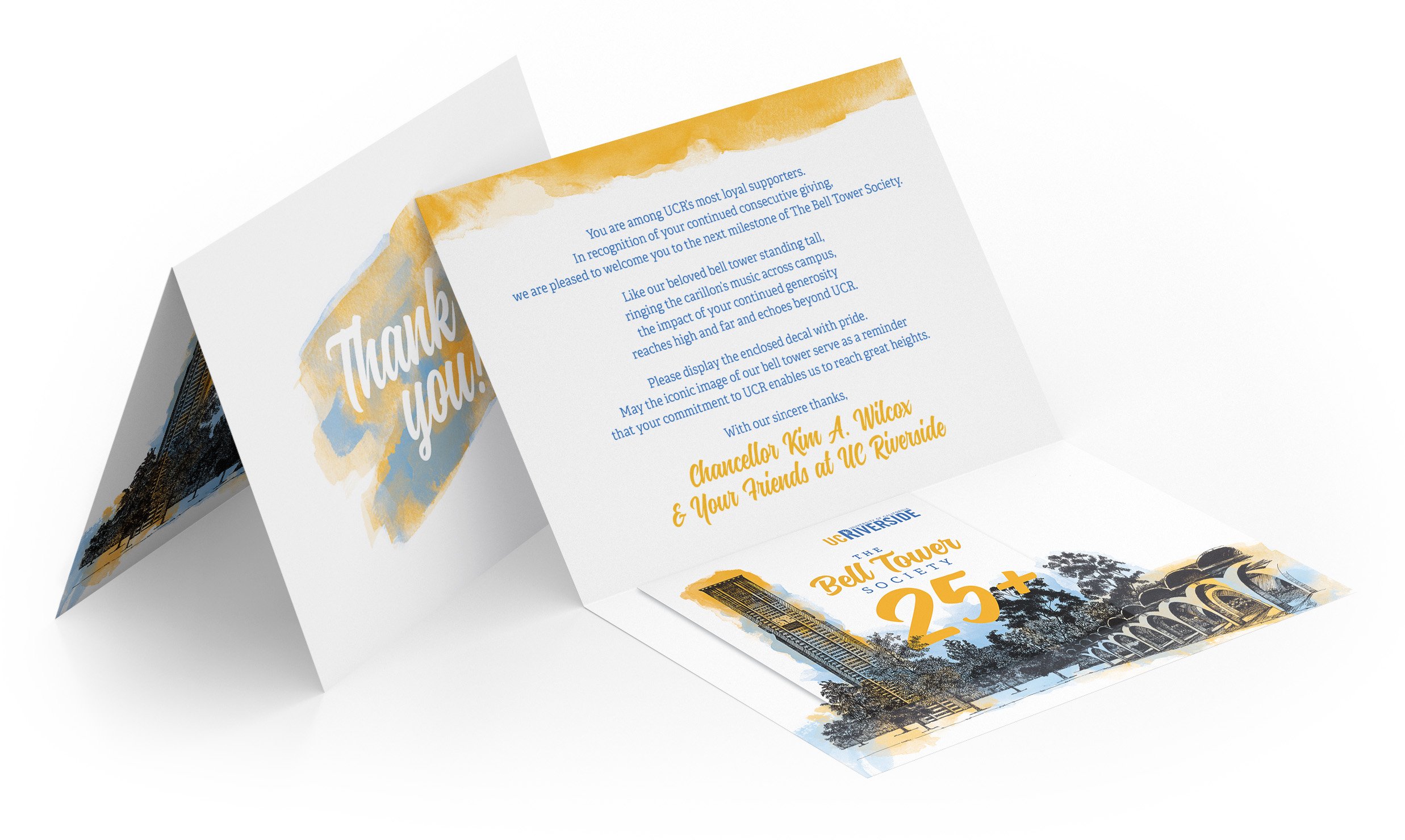
Bell Tower Society Invite Letter
Recognizing UCR’s most loyal supporters, members are welcomed when they make consecutive gifts and my goal was to make the letter and decal they received feel very elegant and special. Printed on premium textured paper, the piece is meant to feel like a watercolor painting.
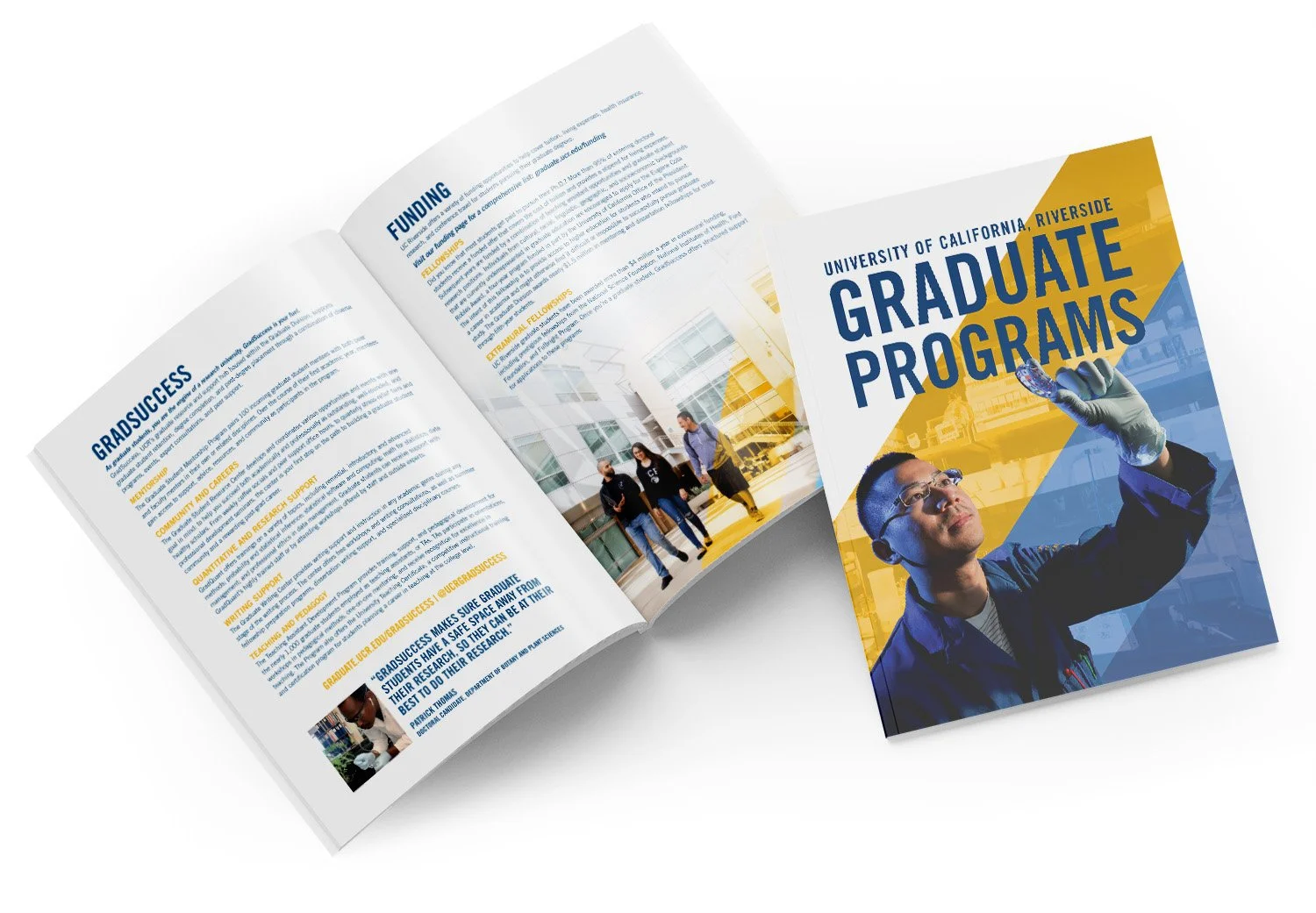
Graduate Programs Brochure
This 20-page brochure was creating right before we transitioned into our new brand, and we were trying to modernize our look and feel and lean heavily on our branding colors of blue and gold. This brochure went out to prospective students and it was important to feature actual student imagery from campus.
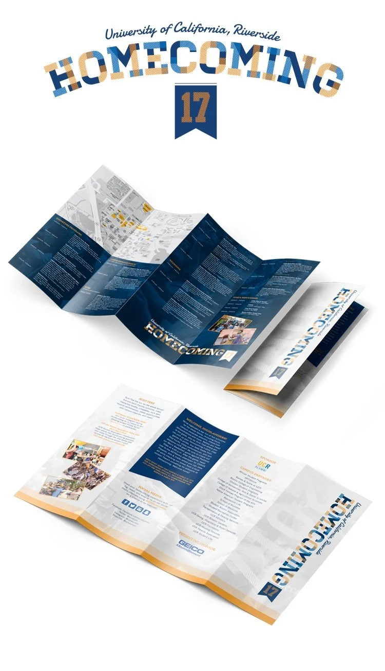
Homecoming 2017
I was responsible for the Homecoming brand refresh and wanted to bring in a type of ‘letterman’ feel to show campus pride and increase attendance. This quad-fold brochure functioned as both a map of campus as well as the schedule.
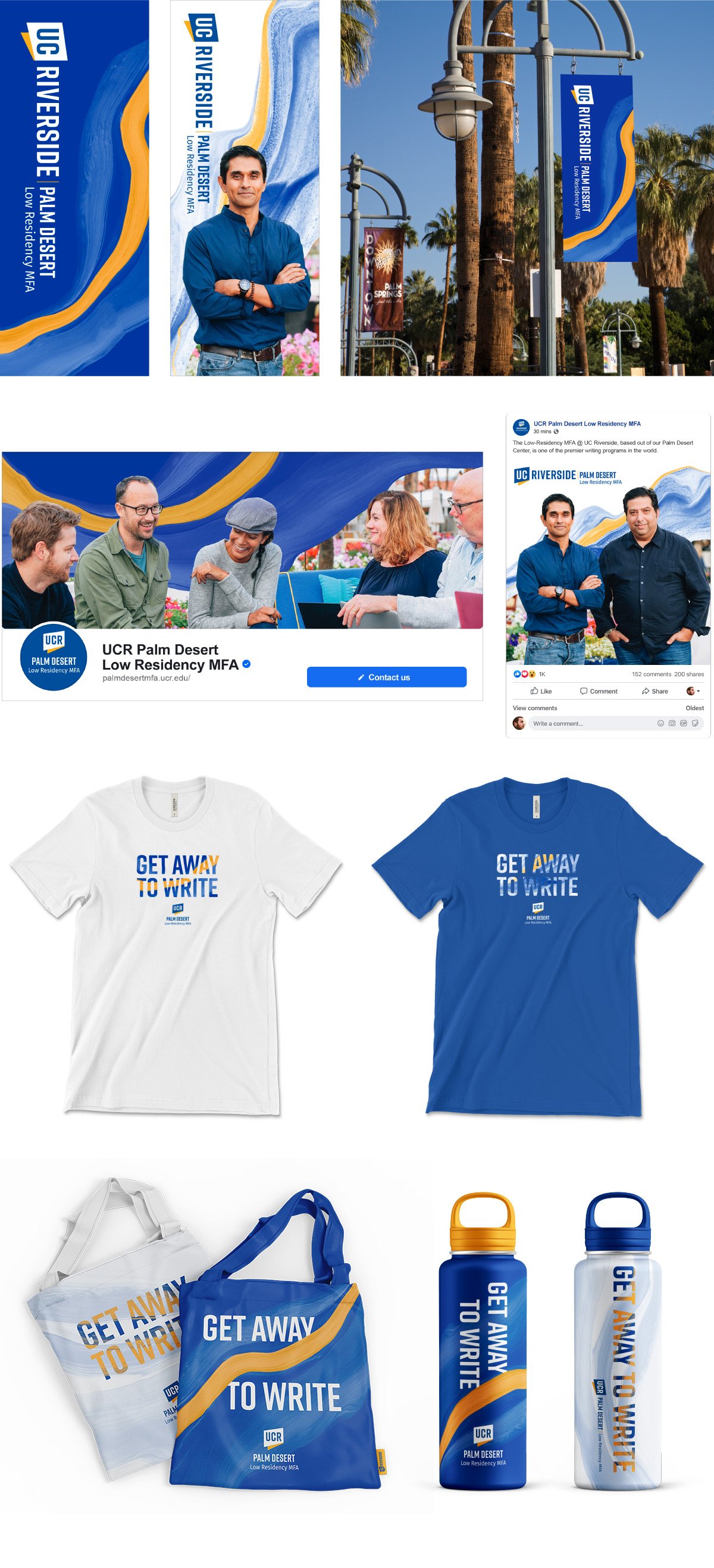
Palm Desert Low Residency MFA
Our Low Residency MFA is a unique program taught at our Palm Desert center and the goal was to refresh the look and feel. The paint represented the journey, the layers almost giving a topographic feel as if climbing a mountain, and the grain within it acts for the sand of the Palm Desert area. We needed the elements to be flexible and to work across multiple mediums which I feel we succeeded in.
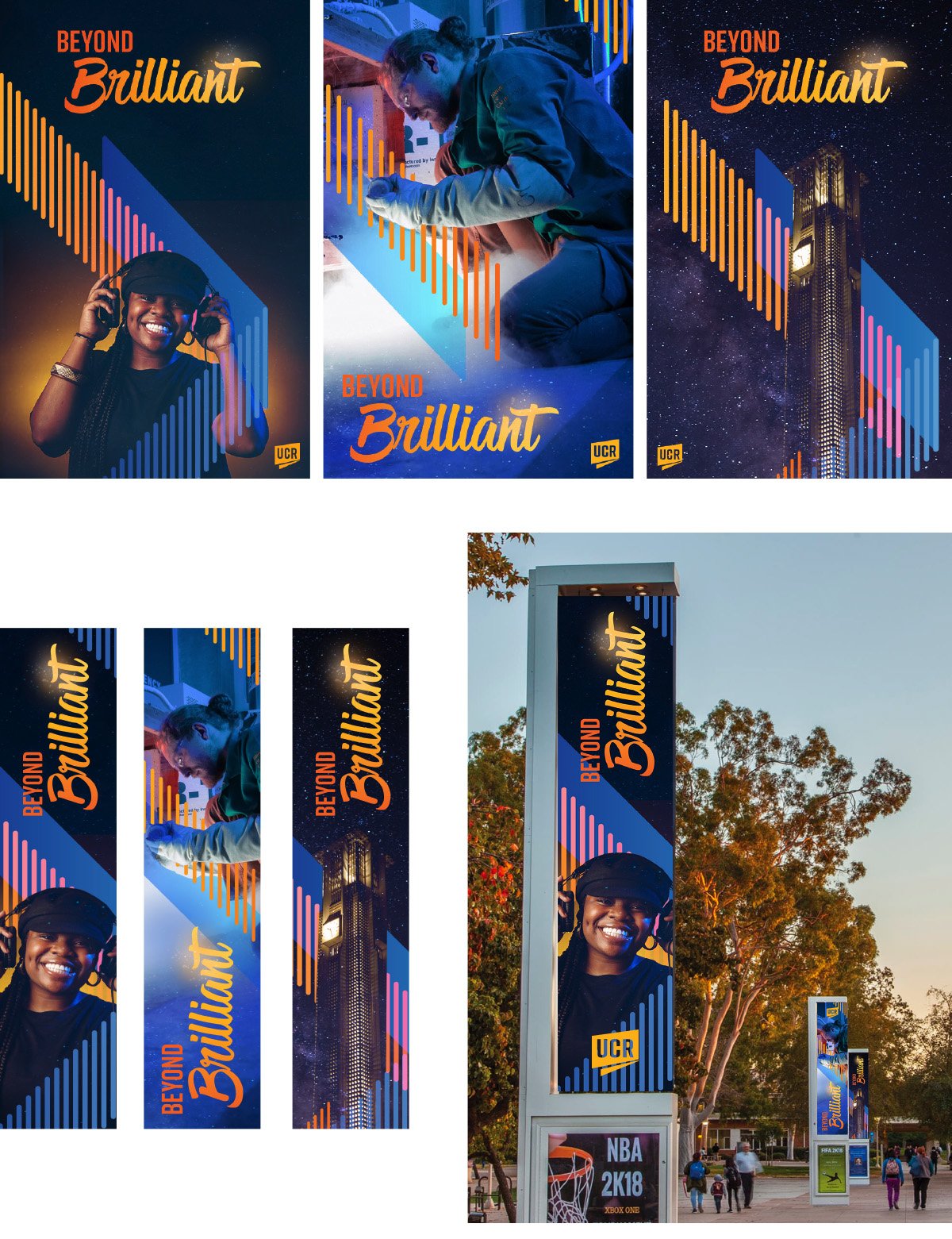
Beyond Brilliant Concept
Beyond Brilliant was UCR’s next comprehensive campaign focused entirely on students. The ‘rising light’ graphics were meant to constitute the donors and how they are supporting students as they wrap around the main subject of the image. Here I wanted to show samples of how the graphical elements could work with a student photo, researcher, and generic campus shot.
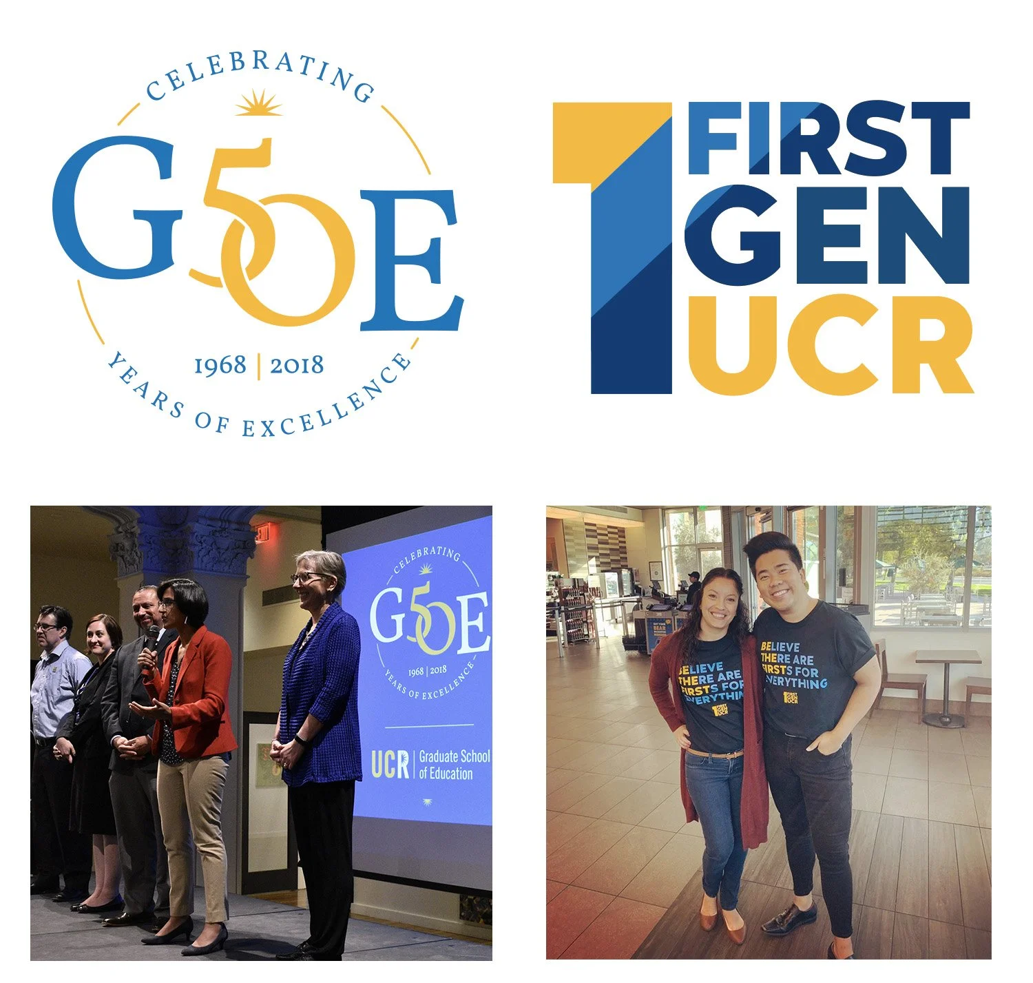
G50E & First Gen UCR
GSOE (Graduate School of Education) was celebrating its 50th anniversary which so I created a special mark for them to use for their celebration, the ‘50’ standing in perfectly with the ‘SO’ on GSOE.
The First Gen UCR mark serves as a special element for staff, students, and faculty who are first generation graduates at UCR. I wanted the mark to be bold, and the layered colors to represent a ripple effect of how first generation individuals can make a huge impact.
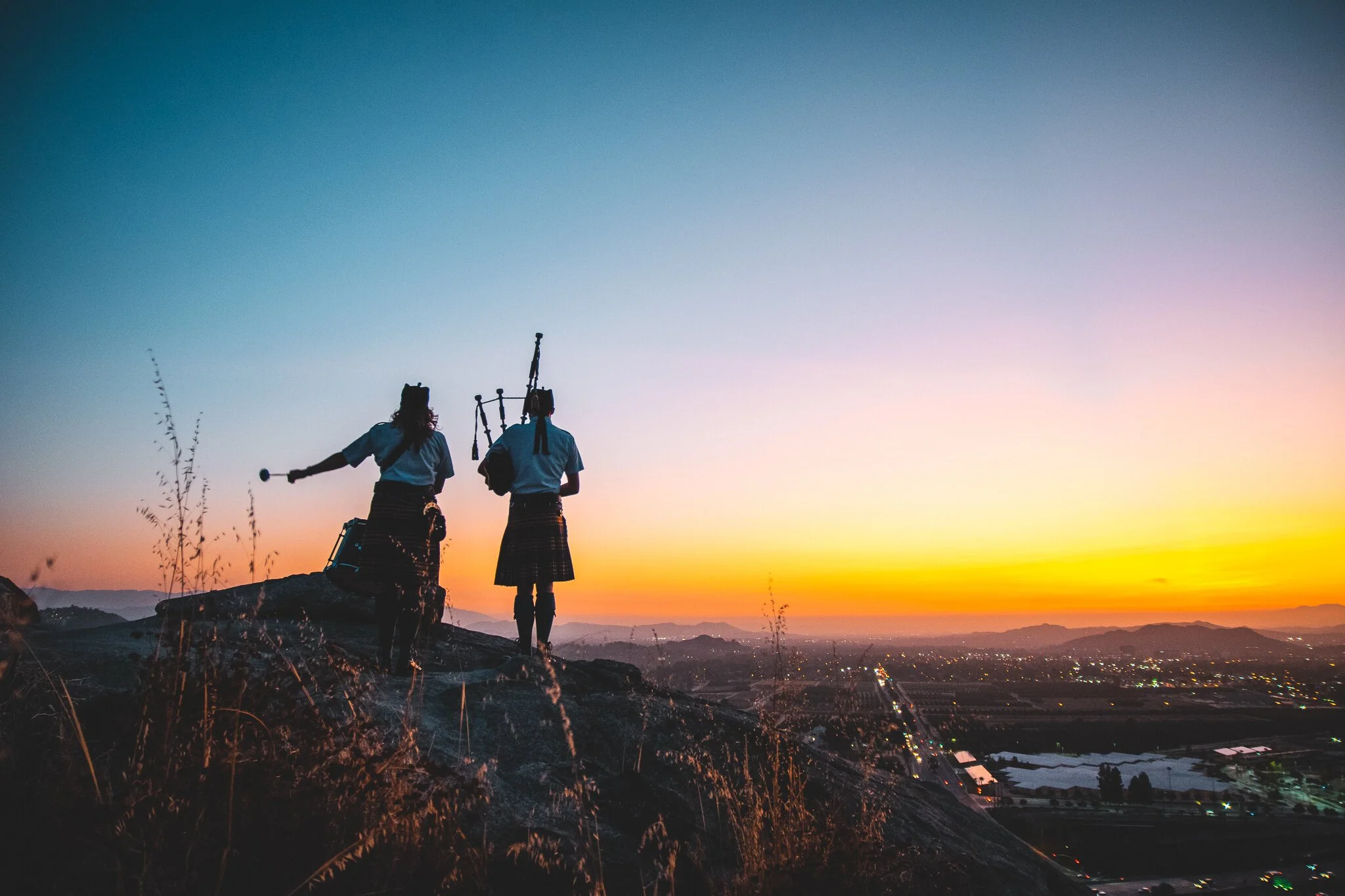
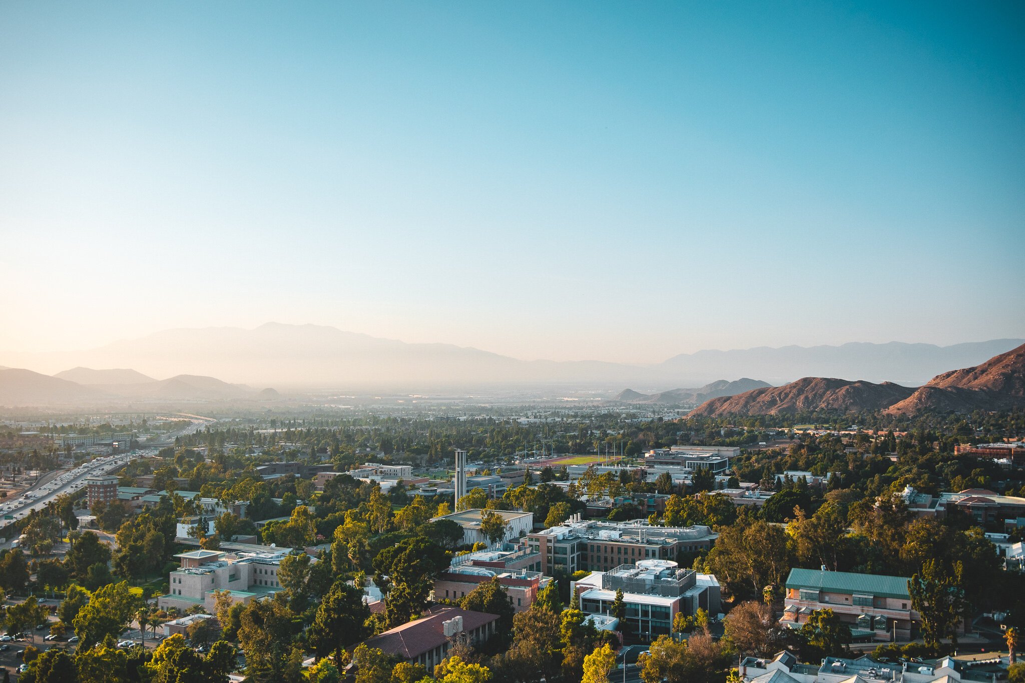
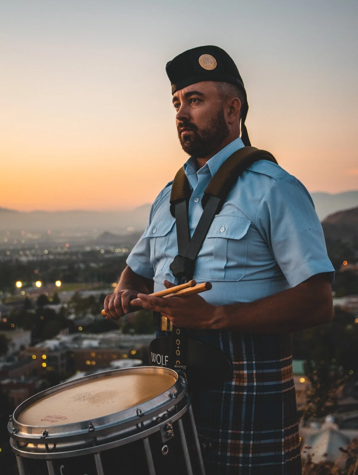
Photography
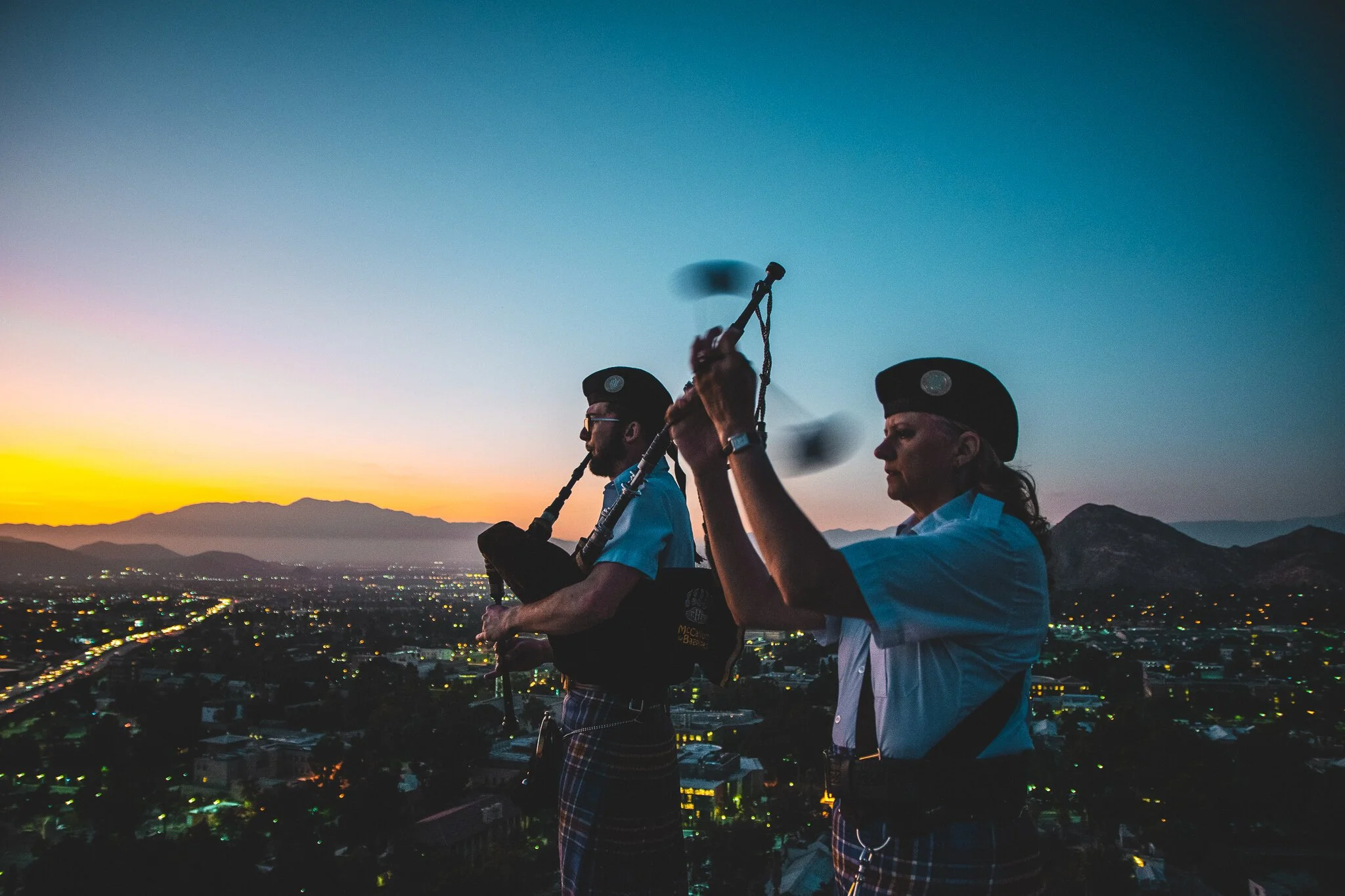
UCR is at the highest elevation of all the UC’s and I wanted to take advantage of that fact in a photoshoot of our bagpipers. The goal was to create ‘beauty shots’ that also featured epic views of our campus.