Remember the Highlanders
Football has always been a popular topic at UCR since the team was discontinued in 1975 despite winning three conference championships in its final three years. My goal was to bring out the nostalgia and history of the team, which required a lot of digging in the UCR archives for proper photos and even old marks which were then photoshopped for repair, then given a two-tone style to give it a retro feel.
Giving Societies Rebrand
Our giving societies were given new names and we wanted to explore different ways we could make a cohesive look and bring all of the giving societies together under the same umbrella. Leaning into the Mid-Century Modern architecture that dominates UCR’s campus, I wanted to build a simple, yet flexible brand that reflected the universities uniqueness and spirit compared to its’ other UC sister campuses.
Bell Tower Society Invite Letter
Recognizing UCR’s most loyal supporters, members are welcomed when they make consecutive gifts and my goal was to make the letter and decal they received feel very elegant and special. Printed on premium textured paper, the piece is meant to feel like a watercolor painting.
Graduate Programs Brochure
This 20-page brochure was creating right before we transitioned into our new brand, and we were trying to modernize our look and feel and lean heavily on our branding colors of blue and gold. This brochure went out to prospective students and it was important to feature actual student imagery from campus.
Homecoming 2017
I was responsible for the Homecoming brand refresh and wanted to bring in a type of ‘letterman’ feel to show campus pride and increase attendance. This quad-fold brochure functioned as both a map of campus as well as the schedule.
Palm Desert Low Residency MFA
Our Low Residency MFA is a unique program taught at our Palm Desert center and the goal was to refresh the look and feel. The paint represented the journey, the layers almost giving a topographic feel as if climbing a mountain, and the grain within it acts for the sand of the Palm Desert area. We needed the elements to be flexible and to work across multiple mediums which I feel we succeeded in.
Beyond Brilliant Concept
Beyond Brilliant was UCR’s next comprehensive campaign focused entirely on students. The ‘rising light’ graphics were meant to constitute the donors and how they are supporting students as they wrap around the main subject of the image. Here I wanted to show samples of how the graphical elements could work with a student photo, researcher, and generic campus shot.
G50E & First Gen UCR
GSOE (Graduate School of Education) was celebrating its 50th anniversary which so I created a special mark for them to use for their celebration, the ‘50’ standing in perfectly with the ‘SO’ on GSOE.
The First Gen UCR mark serves as a special element for staff, students, and faculty who are first generation graduates at UCR. I wanted the mark to be bold, and the layered colors to represent a ripple effect of how first generation individuals can make a huge impact.
Photography
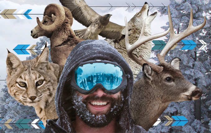
UCR is at the highest elevation of all the UC’s and I wanted to take advantage of that fact in a photoshoot of our bagpipers. The goal was to create ‘beauty shots’ that also featured epic views of our campus.
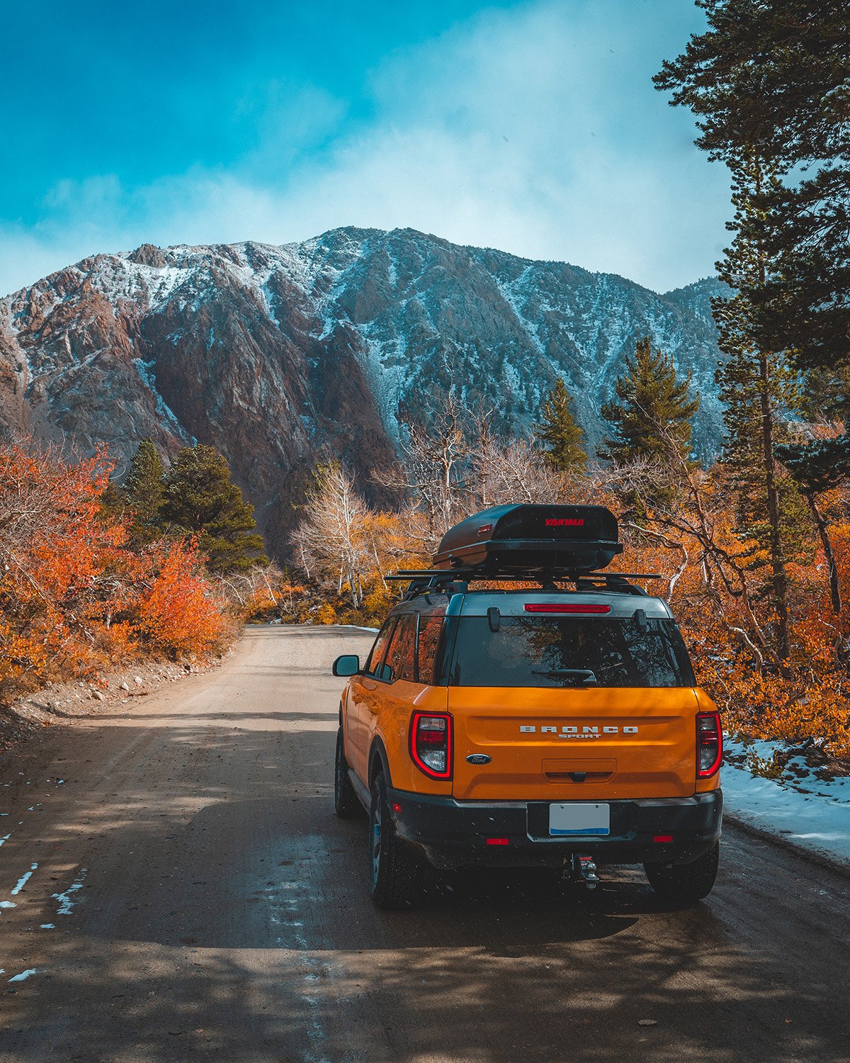
As a Ford Bronco Ambassador, I’ve been tasked to capture the 2021 Ford Bronco Sport in epic locations around the western United States. The goal is to show the Bronco Sport’s capability and flexibility, and that it really is a “go anywhere’ rig.
Ski + Ride Season Pass Campaign
In spring, Mountain High launches their next season pass campaign where buyers who bought their pass early could ski the rest of the current season, and all of next. This campaign featured multiple billboards, ads, and social collateral so it was important to keep the design flexible for multiple uses over different mediums, but maintain Mountain High’s branding with its cool tones and pops of cyan.
Enjoy the Wildlife
Mountain High had two massive tattered billboards that cradled their main lodge when you entered the resort parking lot and it was an eyesore. I developed ‘Enjoy the Wild Life’ and used imagery of the local wildlife of Wrightwood as a play on words (the word ‘wildlife’ was ultimately picked by marketing, you can’t win them all!), along with shots of snowboards and skiers from the resort. These billboard designs were ultimately installed and also utilized as the campaign for that season, and it was awesome to see visitors take selfies in front of them. It greatly improved the entry experience into the resort.
4 Day Tripper/4 Night Ripper
The 4 Day Tripper and 4 Night Ripper were ticket packages created to help increase entry to Mountain High Resort. I wanted to keep the logos simple and flexible, where they could easily be plopped on any sort of marketing material. I used orange to represent ‘day’ and blue to represent ‘night’ and had that color theme flow throughout all of the designated marketing material.
Powder Alliance
Mountain High is part of the Powder Alliance, a group of independent resorts in western North America. When designing these ads, they needed to be separate from Mountain High’s branding, and the goal was to not show any favoritism towards any of the resorts within the graphics. The theme was ‘Wild West Powder Quest’ so I tried to give the pieces a western, rustic, and textural feel.
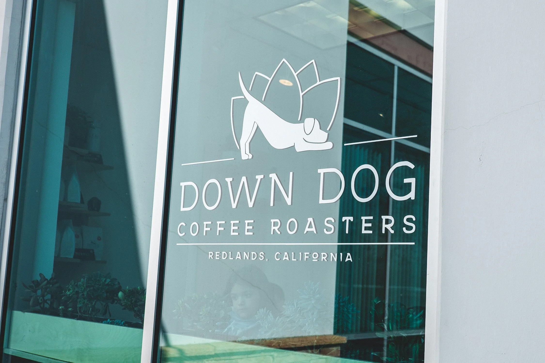
Down Dog Coffee Roasters is an independent coffee shop and roastery located in Redlands, California. Their owners Glenna and Dustin are active yoga aficionados and felt the ‘down dog’ pose provided the most relaxation, and using that visually in their logo best described their coffee experience. The small shop needed a clean, flexible brand that could grow along with them, and I provided the logo, pattern, and packaging. The packaging has a large empty space in the center so they could print out their own coffee labels in-house to help keep costs down.
Charlotte Charles Honey is a personal, fun project based on the show Pushing Daisies. Playing off the whimsical, earthy feel of the show, I heavily based the labels off the arts and crafts movement but with a farmhouse, home-made feel. I created each bottle by hand with honey dippers attached to the cork lids.
Concept design for the Trek 4 Series, a 'budget bike' for the everyday mountain rider. The project included a catalog which focused on the bike features as well as an ad campaign using my own photography. I wanted the ‘4’ in ‘4 Series’ to serve as a graphical element in the layout for each catalog spread and use large images of different parts from the bike to grab the readers attention.
MIPTV 2013 Catalog
Every 6 months Principal Media would send a team to MIPTV, a global TV distribution conference in Cannes, France. They would only have a few minutes to speak with potential clients so it was important to have a catalog that stood out. I achieved this by using big, bright images for every single show we were representing, and also by making the catalog an unusual size. By doing this, our library looked larger and more robust even though we were a very small startup.
Enduro Kings/Environmental Refugees/The Filthy West
When Principal Media acquired shows it was my responsibility to review any marketing collateral it had and create new material if needed. That was the case for these, where I developed a unique look and feel for each show/documentary which was then used to help pitch to potential clients.
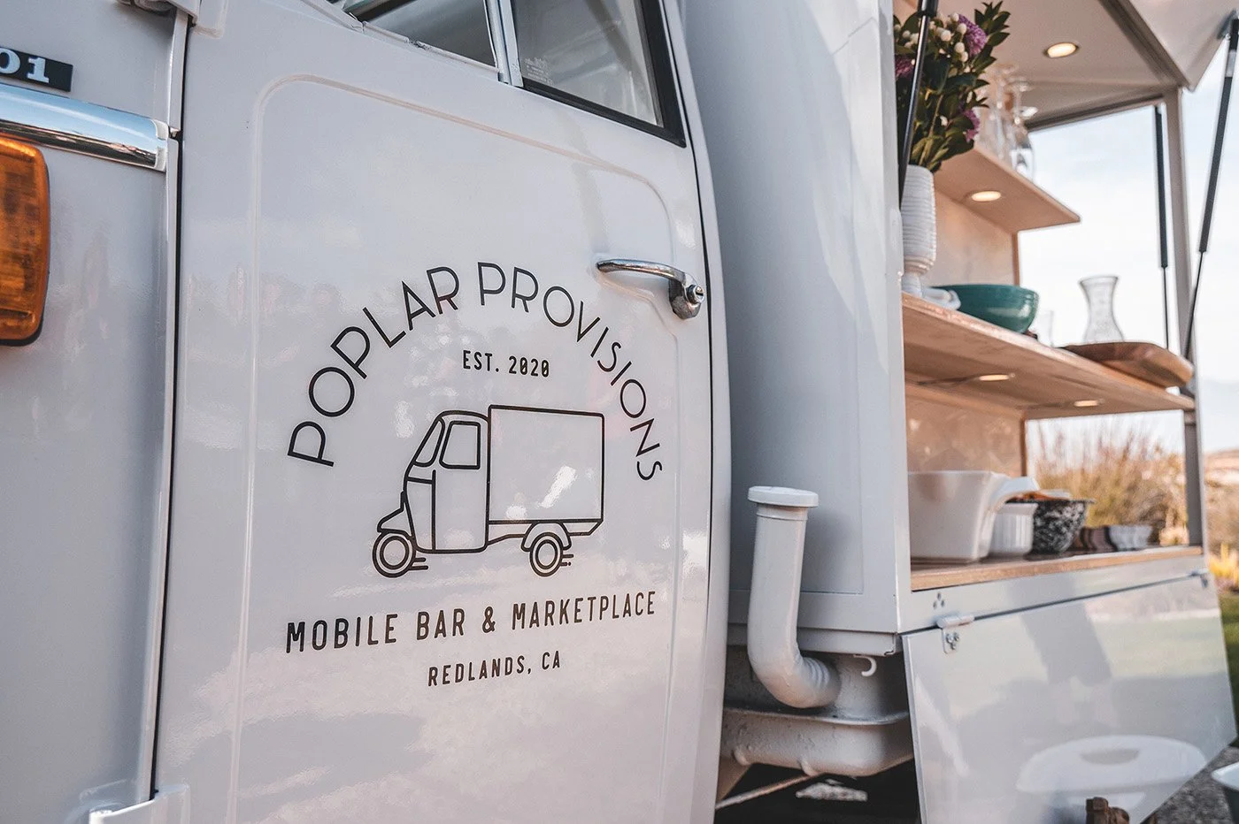
Poplar Provisions is a mobile bar (and marketplace!) that features Pippa, an adorable, Italian VespaCar known as an APE. Her owner Kelly needed branding and photography to jumpstart her business and website. I made multiple variations of the logo so it could be used in almost any scenario (from a decal, to a business card, and beyond!) and also developed graphical elements and templates within the Canva platform so she could build out her own marketing material.
Skyline Socks had redesigned their Boston line and the goal was to create a 30 day social post calendar with flexible supporting graphics. The goal was to connect social posts with games, throwbacks, and current events all related to Boston’s teams.
At Simple Green I was responsible for social and digital graphics, but also liked to have fun with unique in-house projects as well. When we first launched Simple Green Laundry, each employee received a free bottle on their desk when they first arrived, and I created little green shirts in different styles and hung them around the neck of the bottle with a mini clothespin, like it was hanging from a clothesline. Each shirt has a message to check their email for the reveal of the new product launch.
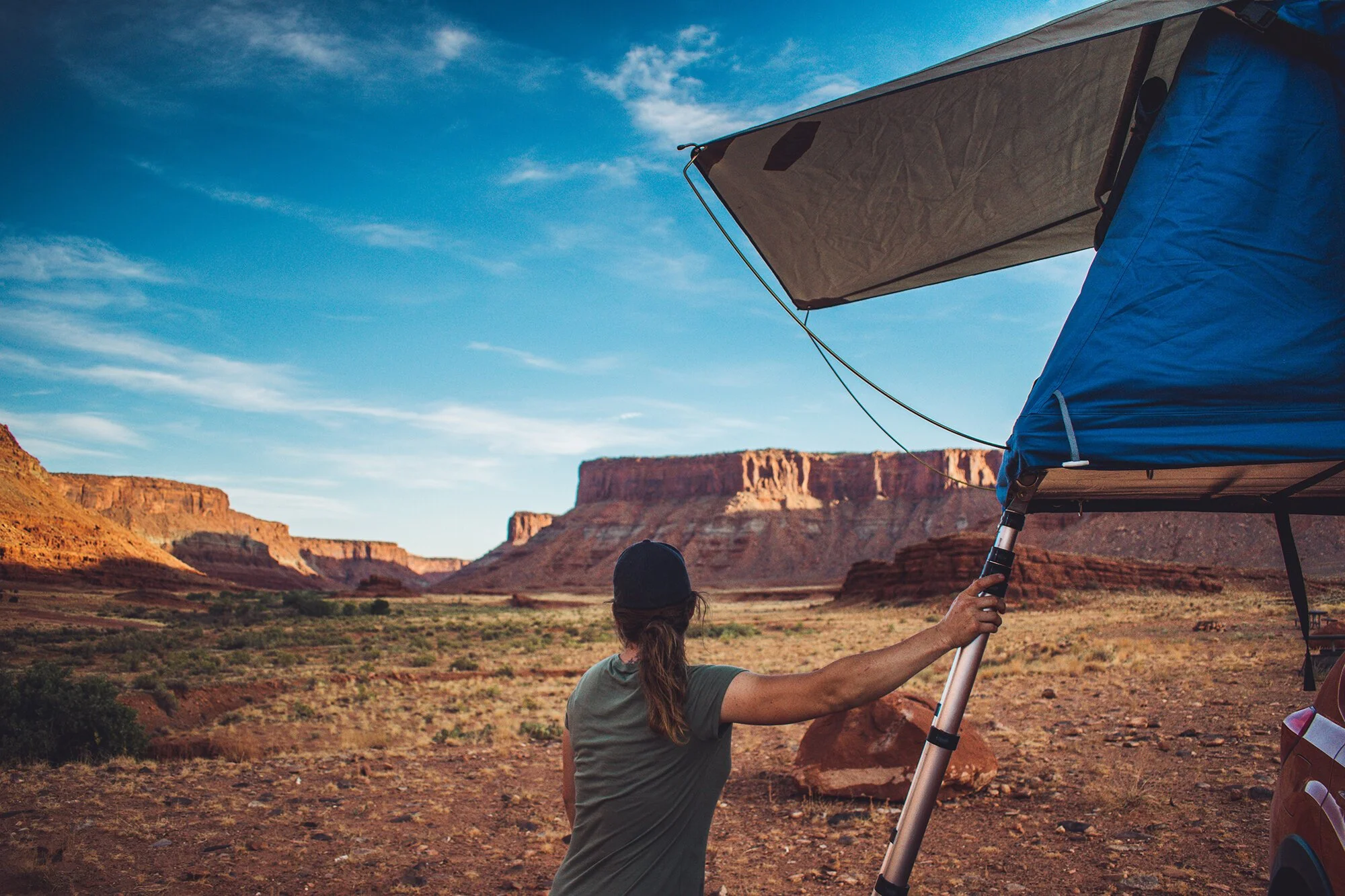
Tepui Rooftop Tents requested photography of their Kukenam 3, Ayer 2 tent as well as other miscellaneous accessories. I took these tents on various rigs throughout different locations, from the Sierra Nevada to Moab, Utah!
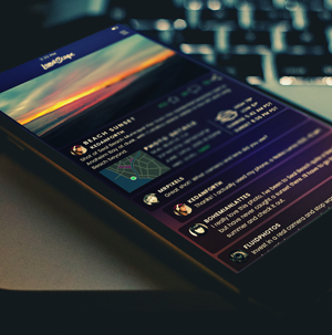
UI design for LandScape, an app that allows users to share landscape photos and the exact location and conditions they were shot in. The idea is to create a community for photographers to share information and assist other photographers in their craft. All photography and animations by me. Tools used: Photoshop, Illustrator and After Effects.
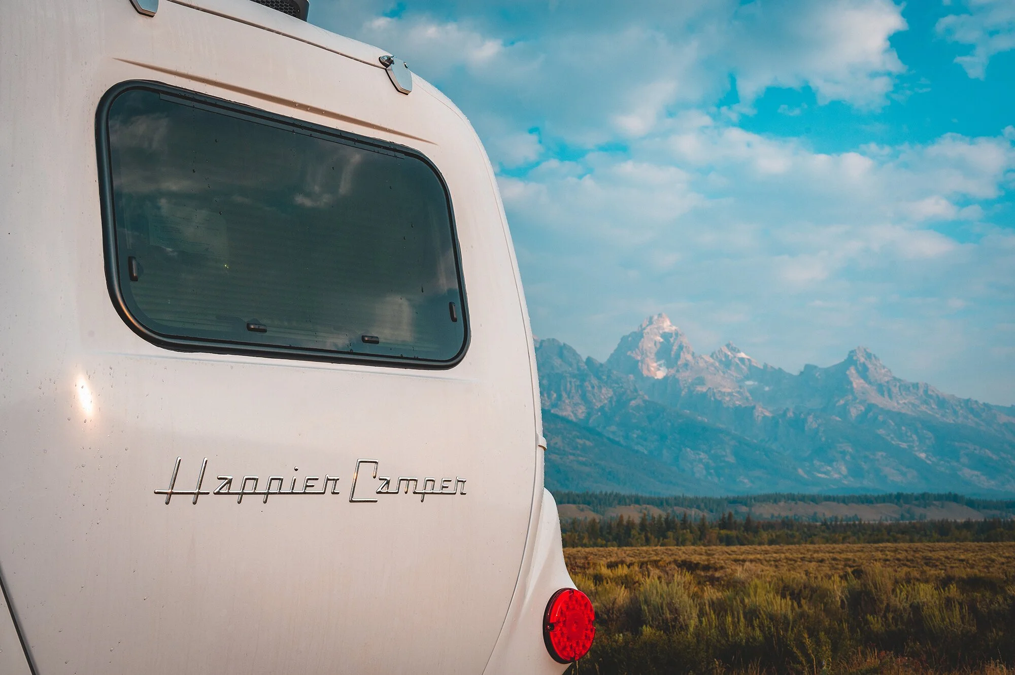
I worked with Happier Camper to photograph the HC1 throughout Wyoming and Montana. It was important to show the size of the camper and feature how incredibly lightweight and compact it was.
ICECO Coolers asked for some photos of their smaller GO20 cooler, and it was a perfect fit in the back of the Ford Bronco Sport. I wanted to show how lightweight it was and that it was easy to carry around, but also fit perfectly in the back of your SUV for those long weekends out in the mountains.
Waybu Eyewear creates sunglasses made out of sustainable bamboo and operates out of Riverside, CA. The purpose of this project was to create sustainable packaging for a 'green' product currently on the market. With Waybu in my own backyard, I contacted the Waybu team and worked with them not only branding, but new packaging made out of 100% sustainable bamboo, recycled paper and soy-based inks.
Luno Mattress had just launched their new blow-up mattress for the Bronco Sport and wanted some lifestyle photos of the product being used. The goal was to show the setup, how the mattress was a literal perfect fit within the Bronco, and how it was a comfy solution to car camping, or for taking a nap after a long hike!
Danforth&Co is a personal project that promotes National Park advocacy and local production. I jokingly call the ‘&’ in Danforth&Co the ‘campersand’ and the simple logo want meant to work on a really tiny scale, such as tags for t-shirts and hats. Not only did I gain experience in t-shirt and hat design, I was also able to work with local vendors for all item production including hats, stickers, and Field Notes notebooks.